
George - Portrait
- Dec 1, 2012
- 3 min read
This portrait was commissioned by a couple who I have worked for before, and they are always quite keen for me to try out new things. The thing that stood out from the photo they gave me to work from was the colour in George's t-shirt, and I had been wanting to try out more work with ink and Brusho dye, so I concentrated on making that part of the artwork really vivid and bright, whilst keeping everything else in traditional pencil. The figure was straightforward and I knew exactly how I wanted it to look, but I had more trouble with the background. I couldn't really decide whether I wanted to keep it black and white, or use colour, and in the end I tried both. Scrapping the colour in favour of more pencil was the right decision, and I am really pleased with how it turned out.

Here are a few process photos which show the process of building up the artwork...


I ocassionally use masking fluid when I'm combining wet and dry media. I used it on this piece because I wanted the colours to be painted very quickly and freely, so they didn't look too neat. Protecting some of the edges makes this easier to do.


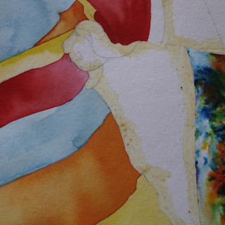
My first idea for the background was to sprinkle brusho onto wet paper to make this multicoloured effect. Masking fluid was essential for this bit.

The masking fluid is peeled off once the paint is dry, leaving a fairly smooth, crisp edge. I did discover though, that it stains the paper ever so slightly. For this piece it didn't matter as I would be shading over everything, but something to note for future usage. Also the edges were not as crisp and smooth as I would have liked.
When I'm drawing I always start with the eyes, specifically the left eye. Not sure why.


The pencils I used for the main drawing bit were 2B and B mechanical pencils, and 3B, 6B and 9B regular pencils, with paper blenders and cotton buds as usual. And in case you were wondering, the tracing paper is to protect the paper surface, because not only do your hands/arms/sleeves smudge the pencil, but the grease from your hands marks the paper - and you can't see it until you go to draw on it!


I had to think a bit before drawing the denim hat, so that I got the texture right. In the end I used the 2B mechanical pencil to cross hatch, taking care to give the lines various different weights. The 4B came in for the darker shadows. I built this up in layers until it looked right, and then just smudged the odd bit here and there with a blender to finish it off.

This was my first background attempt, which didn't work and I instantly disliked it. I had tried to just add a sprinkling of colour, but the brusho is so vivid it gradually exploded into this huge mish mash. Also it made me realise that having so much colour was distracting to the overall drawing. So it had to go!


It was easy to cut the background off with a scalpel, and actually added a slightly 3D look to the picture, which was a bonus! I kept the background simple, just using some smudgy pencil to copy the highlights on the ocean, then darkening the edges to give it a bit of shape.


Comments